I began looking thru the gazillions of photos on my computer to find some that I thought would work. I found one of my car (back when I first got it and it was new and shiny!) and imported it in Inkscape to see how it would look...that is definitely the way I work...lots of trial and error! I didn't even bother trying to make it more contrasty...although I would've if I liked the trial well enough and thought it would help!
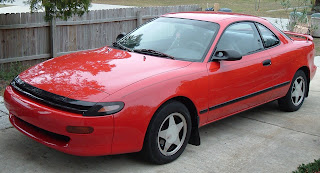
Here is the technique I use to deal with making SVGS...completely learned from Dan99's blog! (
http://dan99.blogspot.com/) Start Inkscape. Click File, Import, browse to the file and click ok. Then change the view to outline (View, Display Mode, Outline) . Then click Path, Trace Bitmap. In the box that pops up, Brightness Cutoff should be selected. I play with the number next to it...lower numbers result in lighter results, higher, darker, which is best for our purposes! Click Update to see the results, and Ok when you're satisfied. There's much more to it than that, but my blog is not going to be so much about the details as the techniques...and possibilities! Please visit Dan's blog and look for his most helpful videos or find a good tutorial for Inkscape!
Here's the Export Bitmap results on my first pass:
And here is the outline result:
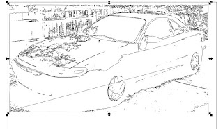
Complete with almost 20,000 nodes!!!! Ack...
Gotta talk about nodes:
Nodes are created when Inkscape automatically outlines your image. Every node changes a straight lines direction, to put it simply. If you want a straight line to curve, you add a curve node and use the nodes handles to adjust the curve the way you'd like.
Well, SCAL uses those nodes to create your cut, and the more nodes, the longer it will take to cut...because the cuts are more detailed. Inkscape automatically adds the nodes when you tell it to outline your image...far more than are necessary!
The easiest way to think of Inkscape and how it works is to think of a circle in Inkscape. A circle can be made with one (or more) node(s). There are three types of nodes (I think!) - a pointy one (to make right angles), a curved one (circles and curved lines), and one with symmetry (whatever you do with one node handle happens to the other one). Each node has little arms that change what it does to your image outline. To change your circle to a square, you would add three more nodes (double click on the line where you want them), then make them all the pointy type (there are buttons for that on the Inkscape toolbar!) and adjust the lines to the shape you like.
SO...there is a simplify button on the Path menu in Inkscape, which removes nodes and simplifies the drawing...but I prefer to have some control over it, especially with people...so they'll still LOOK like the people you know when you're finished! So here's my technique, which is definitely time consuming..but no one ever said perfection comes easily! (THIS is the time consuming part that makes people buy the cartridges!):
TIP: You can highlight multiple nodes by using the tool Edit Paths by Nodes...the F2 key gets you there quickly! (In my REAL life as a computer teacher, I teach keyboard commands frequently!) Otherwise, it's the second tool down on the left side of the Inkscape window, under the arrow. Once you click that tool, all the nodes in your image will highlight so you can see them all. Each node means the line is not perfectly straight...and Inkscape will put extra nodes on lines that SHOULD be straight sometimes. They must be removed so your image will cut in an acceptable time frame! (screenshot of 20,000 nodes!)
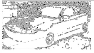
Having the nodes visible makes it a little difficult to see your picture...I haven't found out how to turn them off - yet! The best solution I've found is to zoom way in (shift and the + key) till you can see better. You can also click away from the selection so you can see your image, then click back to keep editing. This does take time though - the more nodes, the longer it takes to re-highlight.
You can drag around a group of the highlighted nodes to select them all quickly and then press the delete key on your keyboard to erase them. I started off in the lower right corner, dragged the selection all the way up to nearly the bottom of the car's door and released the mouse button...when they changed color (to let me know they were selected), just press delete.
Warning: Once you do that, you'll have all kinds of little strange blobs sticking out where they don't belong! That's because the nodes that are left still have their adjustment "arms" sticking out, distorting your image! You can drag those edges back (TIP: by the edge of the image OR the arms!) where they belong or just keep deleting until you're happy with the image and then do cleanup. It's all a matter of trial and error - and knowing my favorite key combo - CTRL and the letter Z (undo!).
So I deleted many many nodes and came up with this:
The result bitmap:

The outline:
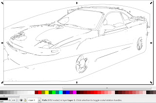
Down to 4350 nodes! You can see the picture is far less detailed but will be much faster to cut! I have to confess that I'm still working on this one but it won't be long now til I cut out my creation! One last tip: The horizontal white highlight reaching from tire to tire on the car's lower door did not come up with enough detail to cut, so I dragged some of the nodes (or their handles) to stretch the line out and widen it a bit. So images can be edited, added to, enhanced, and removed from your photos! I'm actually working on one now with my aunt and uncle together in one picture but I got their images from two different pix!
Here's another that I'm working on: Two of my Yorkies, Gigi and Cody:
First pass, 16000 nodes!
Auto-Simplified by Inkscape: 3,000 nodes! It doesn't look like there's much difference between the two but it's quite obvious up close. You can click on these images to see them in a larger form, btw!

Outline:
Of course, the hard part of this is NOT going to be the creation in Inkscape OR the cutting. It's going to be picking all those little bits of paper out! :) I hope this mini tutorial has helped you understand the capabilities of both Inkscape and the Cricut!
 Here is the technique I use to deal with making SVGS...completely learned from Dan99's blog! (http://dan99.blogspot.com/) Start Inkscape. Click File, Import, browse to the file and click ok. Then change the view to outline (View, Display Mode, Outline) . Then click Path, Trace Bitmap. In the box that pops up, Brightness Cutoff should be selected. I play with the number next to it...lower numbers result in lighter results, higher, darker, which is best for our purposes! Click Update to see the results, and Ok when you're satisfied. There's much more to it than that, but my blog is not going to be so much about the details as the techniques...and possibilities! Please visit Dan's blog and look for his most helpful videos or find a good tutorial for Inkscape!


0 comments:
Post a Comment