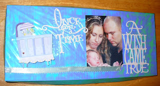
I got my friends book (AND a box for it!) done and delivered in time, and even got a chance to see the recipients (her daughter) reaction! Here's some pictures of the finished product, beginning with the box. I once again cut the top and bottom using DS from 150lb watercolor paper from Michaels (gotta love the 40% off coupons!). Oh, in case I didn't mention it earlier, I cut the pages of the book from the same paper and then wrapped them in cardstock, all cut on the Cricut. I then hot glued the box and covered it in iridescent blue/green transparent wrapping paper from the dollar store, then used some cutouts from Storybook for the sentiments. I got the tiny crib from Walmart on clearance, it lights up when you push the red button. I also used the trick about turning the blade upside down to score the lines in the box, too...love that tip! As usual, the photos can be seen larger by clicking on them.
A shot of the box with the book in it. I made this one square...the Sierra boxes I shaped diagonally on the right side, for the A. I thought it gave it more support if the box fit the book exactly.

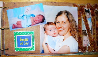
This shot is before I put the yarn on to hold the book closed. I found a cool new way to keep these wordbooks closed (short of Velcroing the pages together!), using some buttons I got made for tie downs at Big Lots. Note that I used the N to frame Dominic's face on the I page behind.

Below is the closeup of the front pages. I wanted to include my friend's photo someplace in the book, so I had to cut the photo in half of her holding her newborn grandson. I don't know if that is an acceptable technique or not but it seemed to work! The photo in the opening of the D is actually a sideways shot of Mom and newborn sleeping. I noticed it's hard to find good photos that are long enough to fill the opening yet slim enough to show what I want fully and clearly. The photo in the swing (in the O opening) just barely fit, so I allowed the feet from the other picture to help conceal the opening. You can see a clearer version of the D in the photo above, and what I mean about the feet in the next photo.
Below is the back of the D. I just love that photo, and the sentiment seemed appropriate. He was a bit older in that photo but it was perfect to cover up the opening in the D.
Back of the O below. Such a cute photo of him and Pooh! The boy is definitely photogenic. He and Sierra are friends, btw, and are so cute together! She doesn't live around here anymore, though.
Proud parents at the hospital. She sure looks tired! I love the way the alcohol ink letters have that pretty shine to them, although it makes it hard to take a picture of them!

I loved this photo, with his little boxing gloves. It's just instinct for a baby to put his hands to his face anyway, and since babies often scratch themselves at that age, it seems like toy manufacturers would MAKE tiny boxing gloves for babies like this! It sure made an adorable photograph! She told me she got these little gloves as something to hang from your rearview mirror, and decided at the last minute to use them in a photo...so cute!

Mom and Dom!

At the beach. He was such a pudgy baby! Such cheeks! Had to include that photo of him in the pot on the stove...Hilarious! The tag says Hamming it up!

I love that "From God" photo. Funny, Sierra had one just like it! Talking about Dominic's cheeks, my friend reminded me that when her daughter was young, she had cheeks just like that! I had forgotten...She sure doesn't have them now!

Back of the N. First shots of an older Dominic. No more cheeks, hehe! He's now four, although he looks a bit older in these photos. He's such a good child, with a great sense of humor! And all boy! I love the photo of him lying down on the ramp...The John Deere photo is really good, too.

This is probably my favorite page. Found the vellum quote @ Wally world - a little booklet of sayings aimed at boys - on clearance!

Back of the I. I made this page with Dominic himself in mind, full of glittery stickers and 3d stickers of Cars characters...he loves them! He's also been to a couple of big truck shows so I thought I'd use those stickers since he was riding his own big truck! And as predicted, he loved that page. You can see the little charm I included on the next page in this photo.

This page turned out kind of plain, but I still think it works. Most of my pages tend to be pretty busy, though! This book was the first time I've ever inked the edges of the photos. I didn't ink them all, but I ended up really liking the effect. It was almost like a shadow. I used Tim Holtz Walnut Distress Ink.
.jpg)
And as usual, I had to put something on the back cover. Couldn't resist that saying, since I had those adorable shots of Dominic as a sleeping newborn! As I said, the completed project has a button on the back (center of the C) that a strip of gold yarn wraps around from one of the rings that bind the book.

So that's it. If you made it all the way through the description of this book, thanks for looking! Off topic, I wanted to put a couple of shots of my cactus blooming on here. The flowers are magnificent, as big as your hand (some bigger), but they only bloom @ night and only last one night! Below this one is a closeup of one of the prettiest so far. You can really see the detail, dozens of stamens, in the large version of the closeup! That's all for now. Happy cutting!


4 comments:
Your word book is absolutely AMAZING!!! What a keepsake that will be for him to treasure always!!!! You did a FANTASTIC job on it!!!!!
You did a beautiful job on this word book! I love it!!!
This turned out absolutely stunning--the alcohol ink technique is fabulous--I've never seen that before and would not have thought of doing that for a wordbook. It really makes it unique.
Thank you ALL, it's certainly high praise, especially coming from Penny, you do such gorgeous work!
I love that AI technique, it 'macho'd' up the page a bit! It really looks like stone in person. I love the butterscotch ink, especially, it seems to have properties that make it look even 'stonier'!
Thanks again!!!
-K
Post a Comment